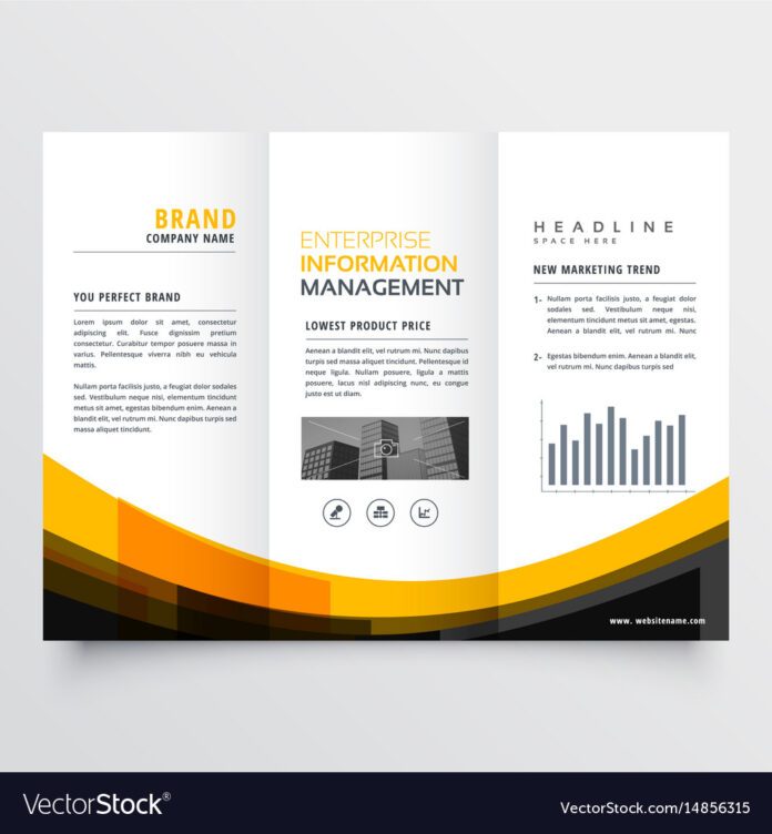
If you look closely at every leaflet design, you will find that every piece is different to an extent. But there is a proven formula coined by Elias St. Elmo Lewis and is named: AIDA to create a successful leaflet. AIDA – Stands for Attention, Interest, Desire and Action – which is the marketing strategy, and best suitable for leaflet designing:
Attention – Your design of the leaflet should be in such a way to grab customer attention and raise curiosity. Attention-grabbing can be done using the bold headline, usage of colours and image. Also, ensure to use the white space efficiently to make the leaflet eye-catching
Interest – To continue the interest of the customers through the leaflet, ensure that elaborate your headline. Ensure to communicate your message for the target audience to respond.
Desire – Once the interest is established in your product or service, next is to ensure that audience desires what you promised to offer through the best use of the high-quality image.
Action – And the final step to help the audience to take action appropriately through a call-to-action strategy. This could be done by encouraging the customers to visit your shop, or website, contact you through call or emails. Ensure you provide accurate and complete information for the customers to contact you.
A professionally designed leaflet can often go a long way in creating the best impression in your customer’s mind. There are various methods of designing the quality leaflets –
Space
Remember: Less is more. When designing the leaflet, no one would want to read the content stuffed in the leaflets. Instead, ensure your leaflet is clutter-free, with enough white place and effective use of the entire space on the flyer.
Use images
Include self-describing images to help the readers understand what you want to convey in just one look. Ensure to use a high-quality photo that is neatly printed on the leaflet. Use the images to notify the products and its prices, and the quality at its best possible way.
Readable
The audience should be able to read clearly and understand the message you are trying to convey through your leaflet. Avoid using light colours texts such as white and yellow. Light colours make it hard to read unless it is printed on a dark background. Use short sentences that are easy to read. Use simple and attractive titles. It is also a great idea to use subheadings throughout the pages and sides of your leaflet that pulls the attention of the readers to further get into details.
Quality
Ensure your offer the best quality content data in the leaflet that is printed superiorly. Content quality and images are helpful as the customers will be able to remember it for a long while.
Colours
Colour is one of the most powerful tools that can be used for grabbing the initial attention for your flyer. Utilise the various colour combination to ensure that your leaflet stands out from the competition. Using bright vibrant colours will demand more attention than the dull boring leaflets.
Are you looking for Print Shop at Romford? We can help you with sols or shared distribution of leaflets that are sure to grab the attention of the individuals and reach out to use your business product or services. We also print leaflets, flyers, business cards, brochures, pull up banners, envelopes, postcards, banners, posters, letterheads, compliment slips, stickers and much more that are high quality printed and cost-effective solution for your business.


